As creatives, we want to believe a good website is defined by the visual design elements used. But, that’s simply not the case. A beautiful website doesn’t mean the site is actually performing. That beautiful site you’ve been admiring could have poor site performance metrics (e.g. high bounce rates, low time on site, low pages per visit and even low conversions) all because they failed to prioritize the usability and utility of the site.
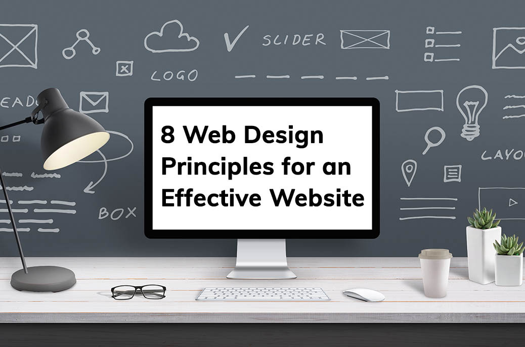
So, what makes a good web design? Below we explore 8 effective web design principles that will make your website aesthetically pleasing, easy to read and use, engaging and effective.
1 Begin with purpose driven design
A website design isn’t something that should be made up as you go. Winging it isn’t a design strategy. Starting with a dedicated purpose gives you a clear plan of how to approach the project as well as a guide for the design and content creation. If you don’t have a specific goal in mind, you won’t know what to prioritize.
In order to determine the site’s purpose/goal, start with your target audience – who are they, what are their pain points and how will your site provide a solution to the problem? Knowing these will help you find the right direction for your site.
2 Keep your website design simple
When you’re designing a website, you want to eliminate as many question marks for the website visitors as possible. The web page you’re creating should be obvious and self-explanatory. An over-designed website may lead to distracting visitors from the main purpose of your website.
It’s Hick’s Law – “the time it takes to make a decision increases with the number and complexity of choices”. In other words, the more options a user has on your site, the more difficult it is to use. It’s your job to eliminate those choices and focus on limiting distracting options throughout the design process for a good user experience.
3 Prioritize User Experience
The less steps you require of a user before they can trial a service, the more likely they are to actually try it. First time visitors aren’t willing to fill out long forms to trial a service they aren’t even sure fits their needs. Let your site visitors explore your site and discover the services you offer without forcing them to share private data with you. Asking a user to enter an email address as soon as they discover you is unrealistic. Let them play with the services you offer and entice them to want to share that information.
4 Engage visitors with visuals
As you’re designing a website you have the option to use both static and dynamic content to attract attention. In excess, these visuals can be distracting but used minimally in instances where a visual enhances the story or text can be beneficial. An image is going to be more attention-grabbing than a block of text. Use this knowledge to your advantage.
Use visuals to:
- Help the user get from point A to point B without having to think about the actions they are taking
- Balance out text or break up the page to give the visitors’ eyes a break from reading
- Make an impactful first impression with aesthetically pleasing graphical elements
- Keep people moving and take navigation from a mindless necessity to an interactive experience
- Add energy to your design, not just take up space
5 Establish Visual Hierarchy
Visual hierarchy is the principle of arranging elements to show their importance. As creators we love to think that everything on the page is important. Reality is, certain parts of your website are more important than others (i.e. points of conversion, call to actions, value proposition, etc.) and you want those areas to get more attention.
The better you manage to provide users with a sense of hierarchy, the easier your content will be to understand. Use color, size, imagery, negative space and texture to establish a focal point that indicates to the visitor where the most important elements are.
6 Ditch Clever for Effective Writing
Writing for the web vs writing for print is different. You should always maintain your brand voice but using promotional writing on the web isn’t going to cut it.
Our best advice? Skip the buzzwords, technical terms and company-specific lingo in favor of using the words your customers use to find businesses like you.
Here a few things to keep in mind when it comes to effective writing:
- Short and concise is best. No fluff needed, just get to the point
- Scannable content is your friend. Bulleted lists, headings and visual elements help with this
- Do keyword research (SEO) to identify words and phrases that are important to your business and use them
7 Don't Be Afraid of White Space
White space helps images and content stand out while keeping the design from being cluttered. It’s hard to overestimate the importance of white space. Without it, key messages can turn into an indistinct blob.
An important thing to note is that white space is not simply blank space. White space allows objects within it to exist. It helps reduce cognitive load, allowing your visitors to perceive the information being presented and makes for a scannable layout which gives the content the dominating position it deserves.
8 Test, Test, Test
Usability tests often provide crucial insights into significant problems and issues related to any given layout. It’s important you test and test often as this is a key element to any great site.
Need help designing and developing your website? Contact us.