Branding and web design are two of our favorite things here at TKG, so when they collided in a Teamwork rebranding initiative, you better believe we took notice.
For those wondering what or who Teamwork is, they are your best friend when it comes to project management. Teamwork is a software suite that “frees teams to manage their work so they can focus on the productive and brilliant."
We read the articles, explored the website and pored over minute design details presented in Teamwork’s brand guidelines and, after much deliberation, settled on a cohesive opinion: it’s not our favorite.
Sounds harsh, but we have our reasons, and if you keep reading/skimming this wonderful ode to branding and web design do’s and don’ts, you’ll discover what they are.
The Highlight Reel
Just because we aren’t in love with some of the decisions Teamwork made when rebranding doesn’t mean that there weren’t some things we commended them for. The wins, if you will.
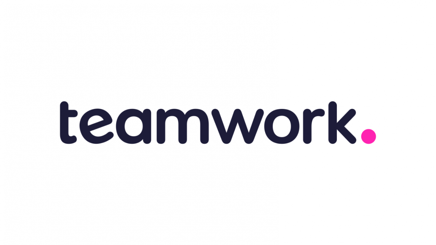
The logo
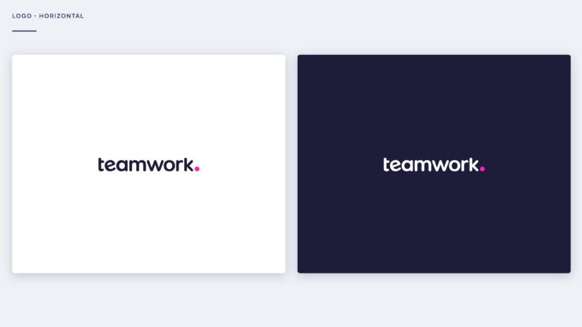
Teamwork’s Creative Director, Brad McLean, nailed it when he said, “While other competitors spoke of teamwork, we were Teamwork. So by adding the dot at the end, we knew we were letting our name speak for itself.”
You can’t hear it or see it but just know that we’re applauding. The logo was a knockout win. The hot pink dot was a bold choice and we love it. Truly.
Simplicity
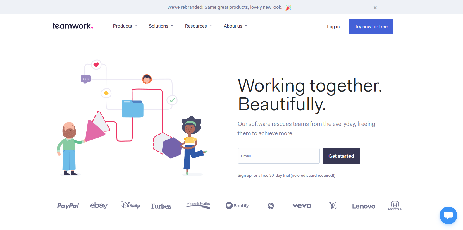
Our designers gave a nod of approval at the use of whitespace and our content team at the balance of content and visual. The simplicity of the overall design was refreshing. Teamwork did what a lot of brands struggle with. They let the content and visuals do the hard work for them. They participated in effective storytelling. Hats off for that!
Font choice
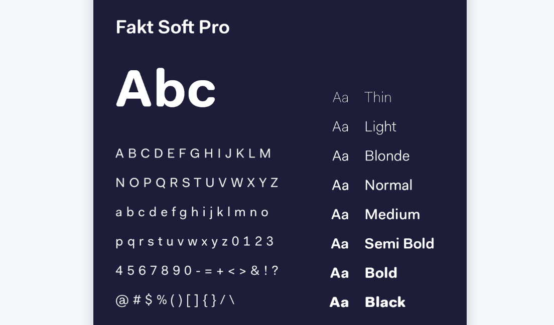
After pushing through our initial resistance to change, we could appreciate the continuity of art direction underneath.
Besides the fact that the font chosen, Fakt, sounds like a curse word when you try to say it in an Irish accent, the font plays nicely with the theme of minimalism and playfulness that is present in their logo and overall web design.
The Bloopers
Perfection is unattainable so it only makes sense that there were things we weren’t crazy about. Right?
Illustrations
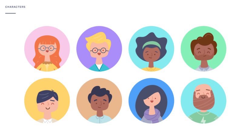
The mark was missed here. The rounded illustrations seemed to be just another design trend that Teamwork felt they needed to include. Illustrations are great for brands like Headspace because the brand is more personal and has a softer journey to sell, but for a professional brand with so much to offer, it felt like it lacked maturity in its execution.
Color pallete
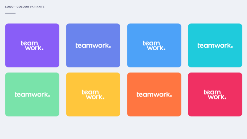
A boundary seems to have been crossed. The overwhelming amount of pastel colors doesn’t give off a sophisticated vibe that one would expect to see from a brand dedicated towards helping business professionals. Look closely and you’ll notice the pallete showcases every color of the rainbow. Sure, the colorful, whimsical style they went with is in right now but following this trend will likely set them up for a refresh in the near future.
Random boxes
SOS. Please help us understand the random floating boxes and dots around the website. If they were just dots, it would be better. At least then we would understand the tie in with the dot on the logo and the overall story of the single dot. But, the boxes? Color us, in one of the 13 colors in your pallete, curious. We just don’t get it. It distracts from the overall messaging and from the graphics that were worked so hard on.
From what we can gather, there is no reason behind them. But, we would love to be enlightened.
The Verdict
Honestly, if there was an IMDb for rating brands and web sites (which someone should definitely create), we would give this rebrand a 6/10. The mark was missed in some areas and then surpassed in others. But, we all know IMDb doesn’t grade easily so we had to be a little harsh with our ranking.
Still, regardless of our thoughts and opinions, we love you, Teamwork. Here at The Karcher Group (TKG), you truly do make the dream work. We can’t wait to see what you come out with next.
If you have branding questions or are looking to update yours, get in touch with us. It’s kind of our jam.